Quick Tips: Enabling Modern Visual Styles on Old Reports in Power BI Desktop

Quick Tips: Enabling Modern Visual Styles on Old Reports in Power BI Desktop

Do you have an old report created in 2016? If you do, then you know that the visuals’ style was pretty different back then. If you don’t like to see all visuals in their old style where the headings overlap the other visuals and you don’t know how to switch the visuals to their modern style, then continue reading. The following screenshot is from a very old report I built for a Power BI demo in Feb 2016! Time flies mate!
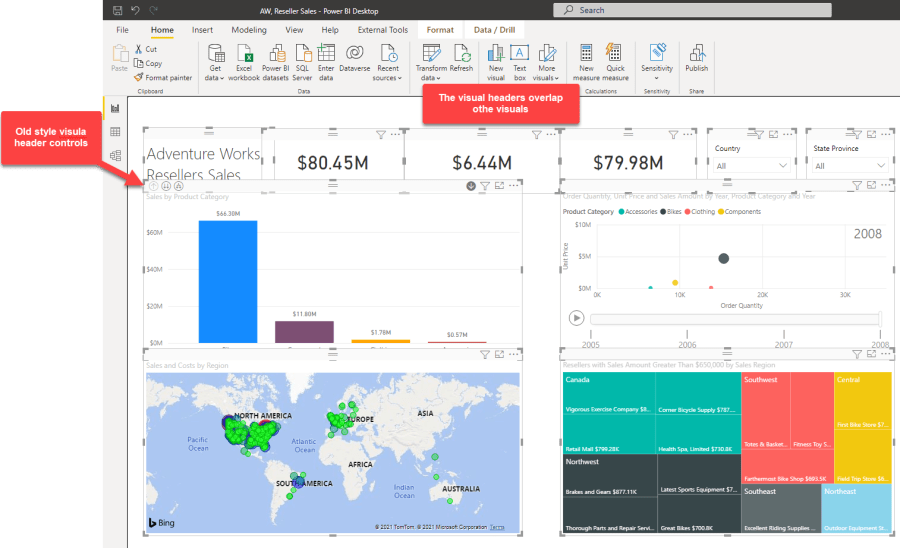
Old Style Visuals in Power BI Desktop

If you are an old Power BI developer, you can clearly remember those days when we had many side-by-side slicers on the report canvas and sometimes it was hard to click a slicer because hovering over the visuals activates the visual frames and it is easy to mistakenly click a different visual.

The other issue with the old visual style is that the Visual Header options of the Visualisations pane from the Format tab are not available for traditional visuals.

Visual header options are not available for old style visual
Visual header options are not available for old-style visual

I see some developers don’t like the old visual style. It is interesting that when we work on an old report, even if we open the report in the latest version of Power BI Desktop, the visuals’ style remains the same and it doesn’t change if we add new visuals to a new page. Some developers go through a lot of pain to get the visuals to work in the modern style. I even know some developers copied all queries from the old file’s Power Query and pasted them to a new Power BI file. Then they used Tabular Editor to copy the tabular objects from the old report to the new one. And some even started to build everything from scratch. If you are one of those developers, be aware that there is a simple setting that can help to quickly switch all the old visuals to their new modern style.

Continue reading “Quick Tips: Enabling Modern Visual Styles on Old Reports in Power BI Desktop”

Integrating and Visualising Multiple Microsoft To Do Accounts with Power BI

Integrating and Visualising Multiple Microsoft To Do Accounts with Power BI

It’s been a while that I use Microsoft To Do to organise my daily tasks. From work-related tasks to buy groceries. While Microsoft To Do is super easy to use but there are some challenges in using it more efficiently, especially when you have multiple O365 accounts within different organisations. Here are some of the challenges I faced; you may face other challenges too:

  • The Microsoft To Do app for Windows devices is very user friendly with amazingly good features like the ability to add multiple To Do accounts. However, we currently have to select which account we would like to use and the app shows all our tasks within that specific account. This means we can not see all our tasks from all our accounts in a single place.
  • The Microsoft To Do app for iOS devices is also very handy to use, but it lacks adding multiple accounts. Hence we cannot see all our tasks from multiple O365 accounts on the app. 🙁
  • We can use the Tasks within the Microsoft Outlook desktop application (I used the Windows version) which is by far the most comprehensive one with tons of features. While we can see tasks from multiple accounts in a single place, it is a real challenge if I want to know which task is assigned to which account. Besides, it is really hard to answer some questions like, how many high-priority tasks I have for today or the week ahead. I know, we can group tasks, but, it is still not so intuitive.

For the above reasons, I searched for a product that can do all the above at once. After spending some hours, I thought, well, I have to do it myself.

With that, let’s go ahead and see how we can get the job done in Power BI.

Note:

This method is not working for Microsoft To Do using personal accounts such as Outlook, Hotmail or MSN. If anyone knows how to add those, please let us know in the comments section below this post.

This is a long post that took me a reasonable amount of time to write. So I added the following table of contents so you can quickly jump to a subject of your interest.

Table of Contents

How It Works

Microsoft Power BI is NOT a reporting tool only. We can connect to many data sources, mix and match the data, create data models and visualise the data. So it should be possible to connect to multiple To Do accounts, append the data, create a simple data model on top of that, and visualise the data to answer our questions or our customers’ questions. The Microsoft To Do data is accessible via the Microsoft Exchange Online connector available in Power BI. The rest depends on our requirements and what questions we would like to answer.

In my case, in which I am the end-user of the report, I would like to be able to know:

  • Today’s tasks: All tasks that their StartDate or DueDate is today or the Tasks without any StartDate and DueDate
    • Number of tasks
    • Number of important tasks
    • Tasks by mailbox
    • Tasks details
      • Task list
      • Task description
      • Status
      • Start date
      • Due date
      • A link to the task itself that I can update if I want to
  • All Tasks
    • All above plus
      • Number of open tasks
      • Number of completed tasks

You or your customer(s) might have different requirements, but once you understand how to get the To Do data from Microsoft Exchange Online and do some data explorations to find out what you are after, you’ll be good.

Continue reading “Integrating and Visualising Multiple Microsoft To Do Accounts with Power BI”

Highlighting Below Avg Sales per Hierarchy Level with SWITCH() and ISINSCOPE() DAX Functions in Power BI

Highlighting Below Avg Sales per Hierarchy Level with SWITCH() and ISINSCOPE() DAX Functions in Power BI

I was working on a project a wee bit ago that the customer had conditional formatting requirement on a Column Chart.
They wanted to format the columns in the chart conditionally based on the average value based on the level of hierarchy you are at.
Here is the scenario, I have a Calendar hierarchy as below:

  • Calendar Hierarchy:
    • Year
    • Semester
    • Quarter
    • Month
    • Day

I use “Adventure Works DW2017, Internet Sales” Excel as my source in Power BI Desktop. If I want to visualise “Total Sales” over the above “Calendar Hierarchy” I get something like this:

Line Chart in Power BI, Total Sales by Year

Now I activate “Average Line” from “Analytics” tab of the Line chart.

Adding Average Line to Line Chart in Power BI

When I drill down in the line chart the Average line shows the average of that particular hierarchy level that I am in. This is quite cool that I get the average base on the level that I’m in code free.

Power BI, Drilling Donw in Line Chart

Easy, right?

Now, the requirement is to show the above behaviour in a “Column Chart” (yes! visualising time series with column chart, that’s what the customer wants) and highlight the columns with values below average amount in Orange and leave the rest in default theme colour.

So, I need to create Measures to conditionally format the column chart. I also need to add a bit of intelligent in the measures to:

  • Detect which hierarchy level I am in
  • Calculate the average of sales for that particular hierarchy level
  • Change the colour of the columns that are below the average amount

Let’s get it done!

Detecting Hierarchy Level with ISINSCOPE() DAX Function

Microsoft introduced ISINSCOPE() DAX function in the November 2018 release of Power BI Desktop. Soon after the announcement “Kasper de Jonge” wrote a concise blogpost about it.

So I try to keep it as simple as possible. Here is how is works, the ISINSCOPE() function returns “True” when a specified column is in a level of a hierarchy. As stated earlier, we have a “Calendar Hierarchy” including the following 5 levels:

  • Year
  • Semester
  • Quarter
  • Month
  • Day

So, to determine if we are in each of the above hierarchy levels we just need to create DAX measures like below:

ISINSCOPE Year		=	ISINSCOPE('Date'[Year])
ISINSCOPE Semester	=	ISINSCOPE('Date'[Semester])
ISINSCOPE Quarter	=	ISINSCOPE('Date'[Quarter])
ISINSCOPE Month		=	ISINSCOPE('Date'[Month])
ISINSCOPE Day		=	ISINSCOPE('Date'[Day])

Now let’s do an easy experiment.

  • Put a Matrix on the canvas
  • Put the “Calendar Hierarchy” to “Rows”
  • Put the above measures in “Values”
Detecting Year, Semester, Quarter, Month and Day hierarchy levels with ISINSCOPE in Power BI Desktop

As you see the “ISINSCOPE Year” shows “True” for the “Year” level. Let’s expand to the to the next level and see how the other measures work:

Continue reading “Highlighting Below Avg Sales per Hierarchy Level with SWITCH() and ISINSCOPE() DAX Functions in Power BI”

Quick Tips: How to Copy Visual Formatting to Multiple Other Visuals in One Go Using Format Painter Tool in Power BI

When you create a report it’s highly likely that you’d like to copy other visuals’ formats from an already formatted visual using “Format Painter” tool in Power BI. Perhaps you already used this awesome tool available in Power BI Desktop.

As you see in the tooltip shown while hovering over the “Format Painter” tool you can simply copy formats from an already formatted visual to another visual. But what if you have a lot of similar visuals to be formatted (painted) like shown in the below screenshot that I have several card visuals on top of my page. One of them is formatted as desired but the rest must still be formatted.

Formatted/Unformatted Card Visuals in Power BI
Formatted/Unformatted Card Visuals

It would be good if I could paint all of them in one go right? So continue reading to see how we can do that.

Continue reading “Quick Tips: How to Copy Visual Formatting to Multiple Other Visuals in One Go Using Format Painter Tool in Power BI”